In this blog post, I will be writing about how I plan to design and organize my Buzzfeed blog post for Project 3.
Creating Visual Coherence:
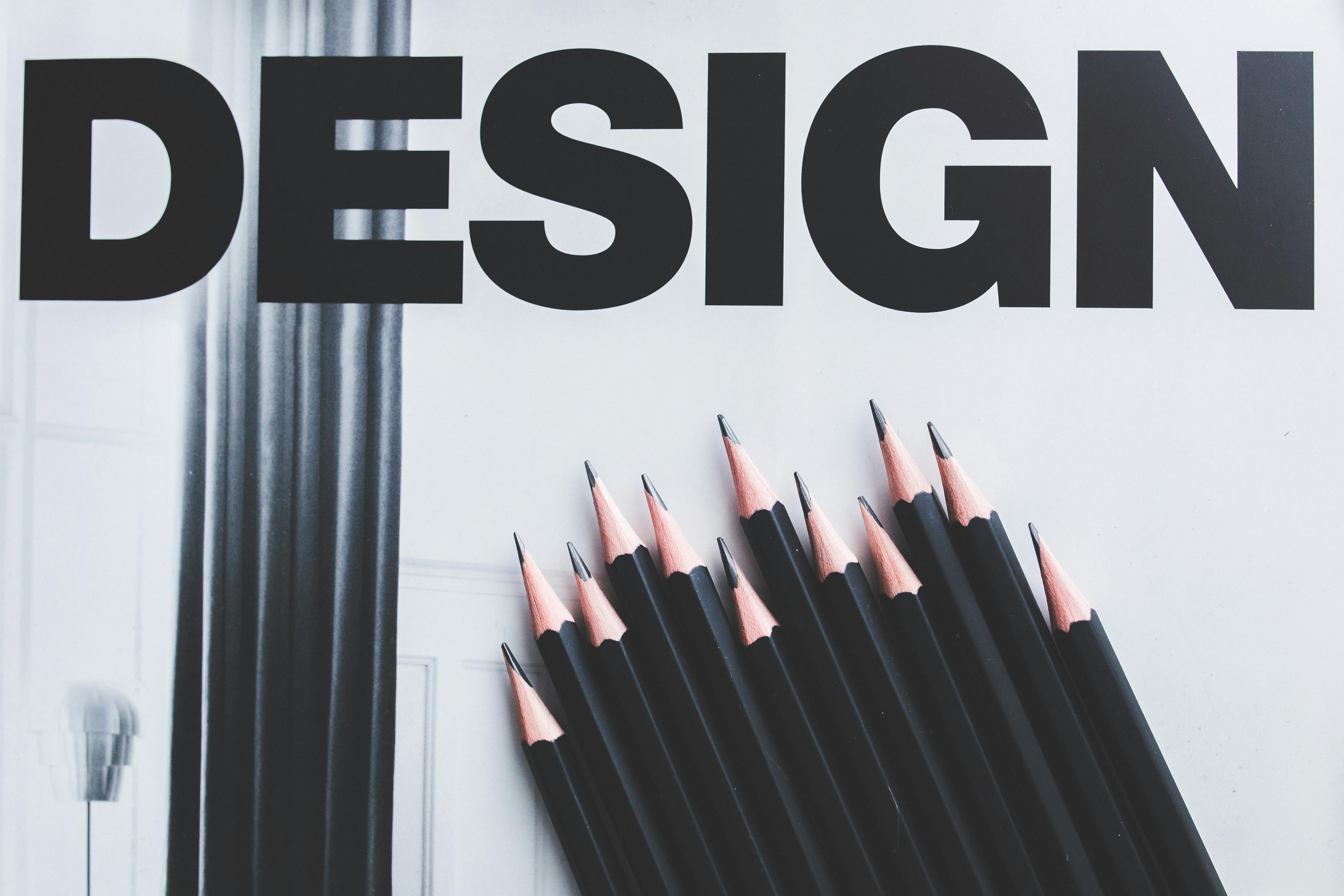 |
| Grabowska, Karolina (2015) "Black Pencils and Design Word" via Pexels CC0 License |
- What color choices...
- Probably black, white, red, and/or dark blue. I want to choose mild colors for my article. However, I will not have much color anyways since it will be mostly black text on a white background.
- Font choices...
- I want to use a basic font. Articles generally contain a standard font that is easy to read.
- Image selection...
- I will choose an image to be embedded into the top/beginning of my article that is clearly related to my text, supports/relates to my argument, and that will draw the attention of my audience. The image could cause an emotional response or could just be interesting in relation to the title, I'm not sure which route I want to go yet.
- Text...
- I will write short concise paragraphs and space them properly so that the blog is aesthetically pleasing for my audience. They will not want to read it if is looks long or difficult to read. Therefore, the spacing between short paragraphs will break up the text making it more organized and easier to read.
- Images...
- I only plan on having 1 or 2 images, so there won't be too much clutter within my blog post. However, I do want at least 1 or 2 images so that my audience isn't bored by its appearance.
- I think that by placing the image at the top, it will guide my audience/readers into the text and help support my argument. I also think that by not adding too many images it will make my blog look more professional and will add to my credibility as the author/designer.
I am doing an article like project too so thought that I wouldn't be using much color as well. Since my background will be white I thought that a black font works best as well. My font would be basic as well. I was thinking of using an image that invokes emotion as well because it can invoke emotion very easily. Continuing on images I also thought that I would only use one or two images.
ReplyDeleteYou seem to be going toward the path that I am with the visual aspect of the assignment...clean and neat. I think this will benefit both of us by making it easy for the reader. Too much wordiness, color, and whatnot can get distracting! Can't wait to see the final.
ReplyDeleteI am writing in the same genre as you for this project, thus I can really see that you did a good job analyzing the visual elements that are helpful for blogs. Having one to two relevant images will indeed keep your work interesting and simple. Also, having short and concise paragraphs is very important and something that I will specifically need to work on. Good job!!
ReplyDelete